Do you believe in second chances?
Breathing new life into PECKISH, from packaging to website
Overview
The Challenge
PECKISH had been on shelves and available via e-commerce for about a year, and we wanted to take all of the customer feedback and iterate on it, launching PECKISH v2. I worked with an external design agency to update the PECKISH packaging to meet the consumer feedback, and refresh the website to reflect the new packaging & ecommerce goals.
M Y R O L E
Researcher // Project Manager // Strategy Lead
T E A M
Claire Andreas // Lauren Egan // Danielle McWaters // Galen Strassen // Paige Starks
M E T H O D S
User interviews // User survey // Design Strategy // Design Systems
D U R A T I O N
12 week packaging & web design sprint
The Problem
PECKISH consumers wanted a product with less packaging, and the previous format had 4 separate pieces of packaging that needed to be opened and then thrown away.
Users didn’t necessarily need a subscription format to allow them to consume the product in the way that they desired. Requiring a subscription was a high barrier to entry for new customers, and we didn’t offer any other option to drive trial.
The Solution
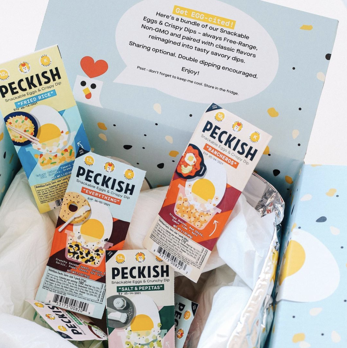
By redesigning the packaging to be one seamless experience, rather than multiple different pieces of packaging to open, we were able to meet the user’s desires to have less waste and a more “on the go” eating experience.
By removing the subscription format and selling PECKISH via Amazon Seller Central, we were able to maintain our current shipping & e-commerce needs while meeting the customers’ desire for more flexibility. Additionally, this allowed new customers to try the product in an easier way.
Research
User Interviews
Before getting started, I wanted to understand how past and current subscribers were using the product and how the experience could be improved - if they were still subscribers, what did they like? If they were canceling their subscription, what could have been improved?
Personas
Longtime Subscribers
I spoke with 5 consumers who had been ordering the product consistently for 8+ months.
Subscription Abandoners
I received survey responses from 50 customers who were cancelling their subscriptions.
Insights
Feedback from current, long-term subscribers was that they love the product, and the convenience makes the price worth it. However, 50% of customers said that they would prefer a more flexible option over the current offer.
87% of exit survey respondents said that they were “extremely” to “somewhat” satisfied with the product, which shows that their reason for their cancellation wasn’t about being dissatisfied with the product. Rather, they didn’t want to be locked into a subscription.
“I would like to be able to [buy PECKISH] in the quantity and frequency I choose, without a commitment.”
- Exit survey respondent
Design Process
Website Redesign
I worked with our engineers to remove the e-commerce function and redesigned the site to act as an educational landing page about the brand. We also made sure to keep the ‘where to find us’ page at the top of the hierarchy, so consumers coming to the site to learn more could easily find PECKISH near them.
Packaging Redesign
“Find a way to become more sustainable! I just feel bad wasting so much packaging”
- Exit Survey Respondent
From my research, we found that another big contributor to people’s hesitancy in repurchasing was due to wasteful packaging. I worked with Designsake Studio, a San Francisco-based design agency, to redesign our packaging and make it more sustainable.
Because dipping eggs in a dry dip was a new eating experience for many potential consumers, we knew that it was important to communicate exactly what exactly to do with the product better than we had in the first iteration. This led to multiple explorations of packaging styles and designs.
PECKISH v1 was inspired by bento boxes; a cardboard box could be pulled open to reveal two individually wrapped eggs and a small cup of crispy dip.
Different packaging explorations from review rounds 1 and 2.
Designs by Designsake Studio.
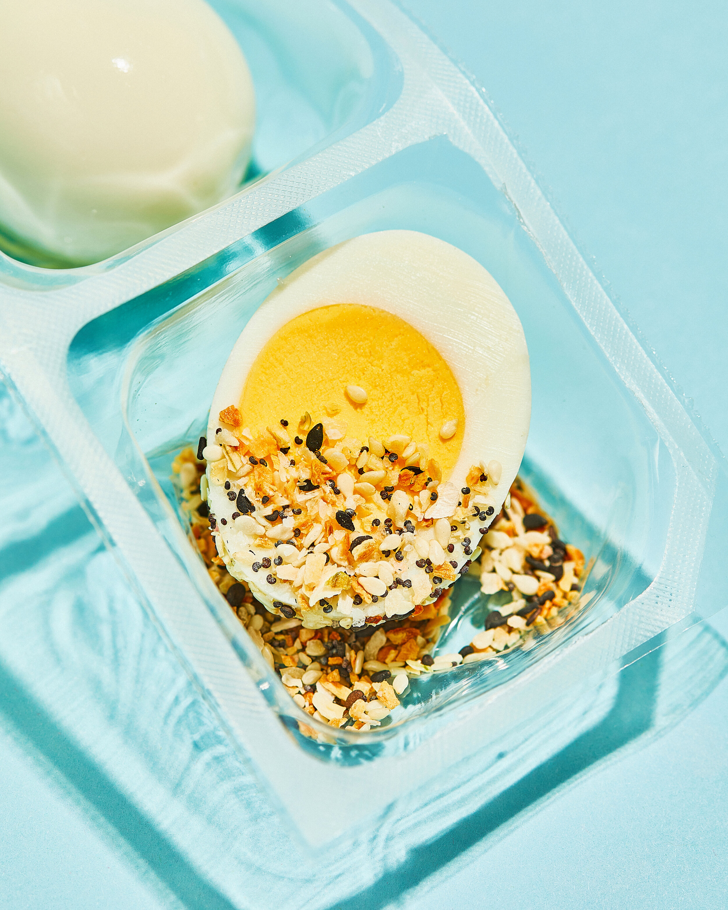
Our final designs used the dipped egg without the hand or flavor cue to keep the packaging simple and focused on the eating experience.
We integrated the illustrations of the hand dipping the egg onto the website, but because we did the rebrand during the height of the pandemic, we were hesitant to put hands touching food on the packaging.


Takeaways
Keep it simple! We went through many iterations of the site, and what we found worked well was to keep it as simple as possible. Because we were actually removing purchase capabilities from the site, and because PECKISH was still so new in the market, we wanted to make sure that the website met the needs of the new visitor, who was just coming to look for more information on the products and not take any action.
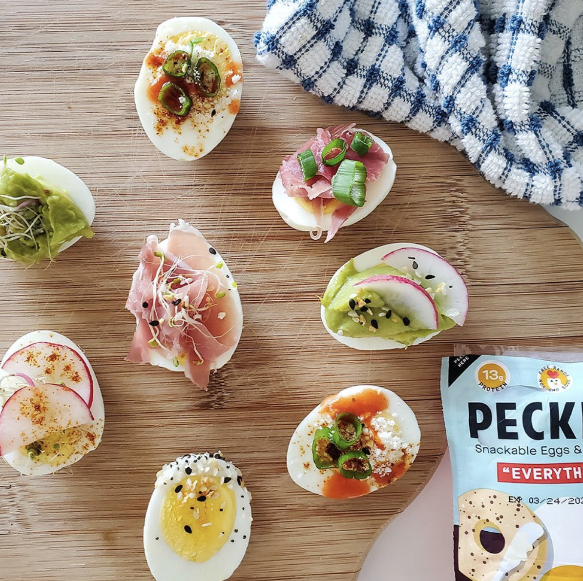
How obvious is too obvious? The packaging redesign included updating the packaging art. With the first version of PECKISH, consumers questioned whether the product was meant to be dipped, sprinkled, or eaten as a full meal - this indicated to us that we weren’t being clear enough or that the packaging format wasn’t familiar to our consumers. Because of this, we decided to remove some of the mystery around the product and *show* them how to use it, rather than make any assumptions.


