
MixPose Yoga
Making Smart Yoga Even Smarter
Overview
The Challenge
MixPose’s streaming platform leverages artificial intelligence to empower yoga instructors, personal trainers, and dance teachers. They host daily yoga classes via their platform. Instructors on the platform need more information about their students before and after class.
{ 3 week design sprint }
M Y R O L E
Researcher // UX/UI Designer // Project Manager
T E A M
Claire Andres // Haley Jensen // Owen Osayande
M E T H O D S
User interviews // User survey // Heuristic analysis // Wireframing // Prototyping
T O O L S
Figma // Airtable // Asana
The Problem
The MixPose platform doesn’t provide necessary student information to instructors, which prevents instructors from being able to tailor the class to the enrolled students.
MixPose also doesn’t effectively encourage students to provide post-class feedback, which prevents instructors from learning what their students enjoyed and what they didn’t.

Current MixPose onboarding
The Solution
Prompting new students to provide information about their experience, goals, and preferences when they create an account, and making it visible to the instructors, will allow the instructors to get a good snapshot of who will be taking their class and adjust accordingly.
Additionally, requiring students to provide some feedback after their classes will give the instructors vital information about how the class went. This in turn allows them to make changes & develop the class taking feedback into consideration, which will likely improve the student experience and increase the number of returning students.

Research
User Interviews
I interviewed instructors on the platform to understand what information they need to know about their students and when, and interviewed students to find out what kind of information they’re comfortable sharing.
Personas

T H E I N S T R U C T O R S
Instructors are currently feeling disconnected from their students - because they’re teaching through a screen, and because they’re unable to communicate with students through the MixPose platform.

T H E S T U D E N T S
Students are using online fitness apps due to the pandemic, but struggle to stay motivated because the online experience doesn’t provide the same kind of community or accountability that their in-person fitness classes did.
Competitive Analysis
In our competitive and comparative analyses, I looked at the new user onboarding flows for services in the health & fitness space and outside of that. Because MixPose is a new app and a new concept, I wanted to make sure we were designing a familiar user flow so users wouldn’t be driven away.
Every competitor I looked at used simple, 3-4 question flows that had pre-determined selections, so the user wouldn’t have to put in too much time or thought. The questionnaires were made more interesting and inviting to fill out through interactivity and imagery.

Yoga Glo onboarding
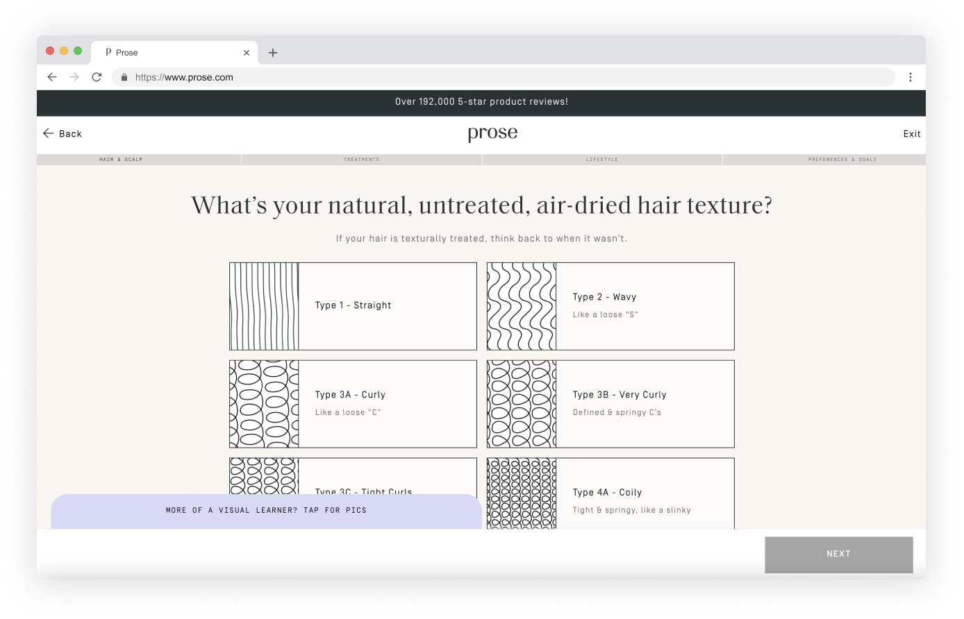
Prose hair questionnaire
Insights
01
C O M M U N I C A T I O N
Providing a way for students and instructors to interact outside of classtime helps create a more personalized experience.
02
I N F O R M A T I O N
Users are happy to provide information if it’s worth their time. They’re less likely to share personal information out of the blue or if they don’t understand how it will be used.
03
A N A L Y T I C S
If feedback and analytics aren’t useful or intuitive for users, they won’t be used.
Testing
I conducted 2 rounds of usability testing with low-fi and then mid-fi wireframes with students and instructors so we could see both groups go through their new flows, understand pain points, and iterate based on key qualitative and quantitative feedback.

F A M I L I A R O N B O A R D I N G
The onboarding flow asked the right kinds of questions; they don’t require much mental bandwidth because they are pre-filled.

S T U D E N T I N F O
Instructors liked that they had the necessary info about students in their pre-class page, so they could see everything in one place.

C H A T
The chat function was a game changer for the instructors - they loved that they would be able to communicate with students individually or in groups on the platform.
Design Process
Student Wireframes
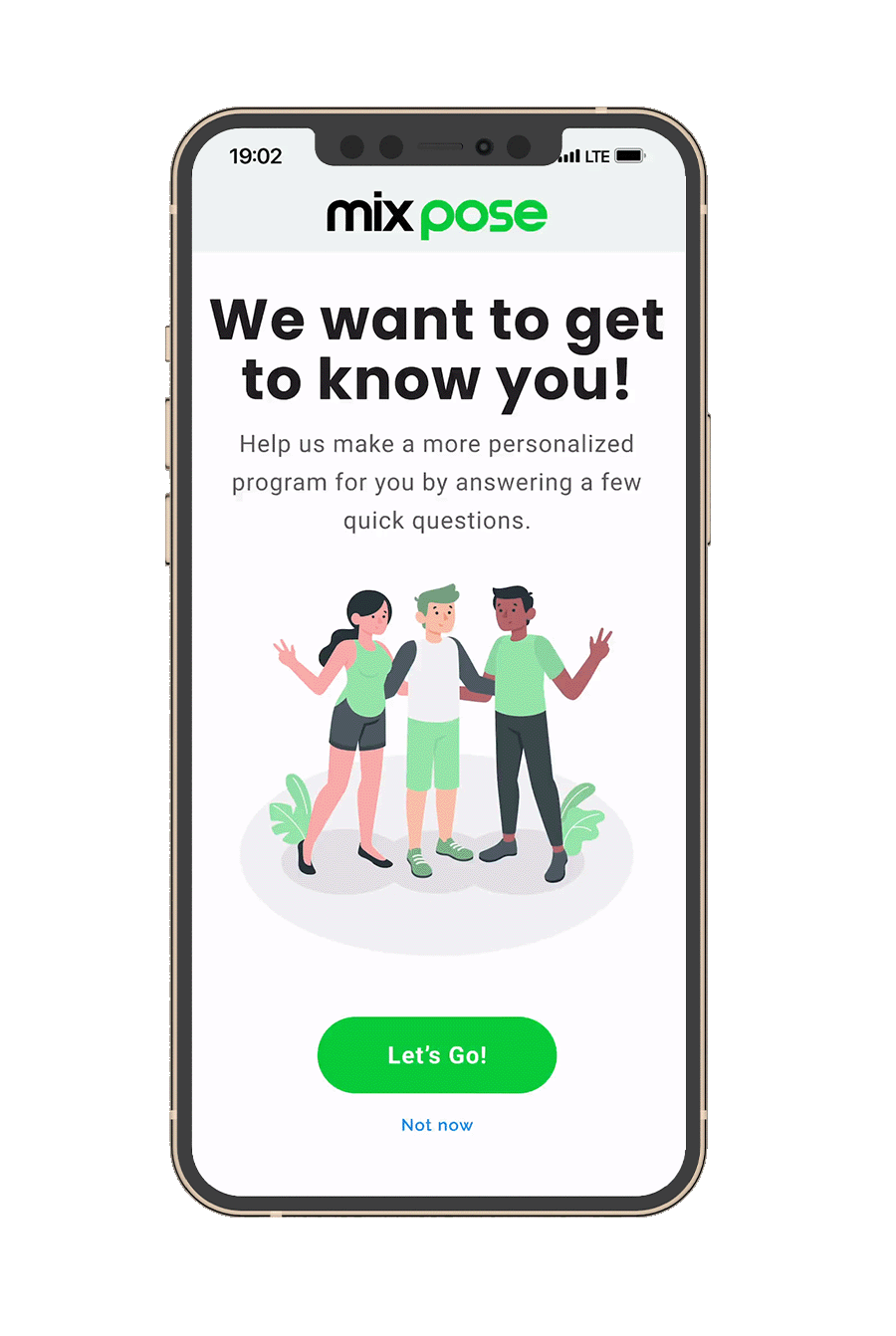
User Onboarding
The main information the instructors needed was about injuries and other body conditions, yoga experience, and goals. I developed engaging ways to collect necessary information from the user without relying on form submissions.
Student Feedback Flow
To get the most responses possible, I designed a simple 3-question screen that triggers on the student app when the instructor ends class.

Instructor Wireframes
Based on our user interviews with instructors from the MixPose platform, I redesigned the dashboard to make the key information requested available at all times.

Simple user onboarding
I designed a familiar user flow that asks the students signing up three key questions in the ‘register’ section. Because users are in the mindset to provide personal information during onboarding & account creation, I took that as an opportunity to ask for the information that instructors requested.
On the instructor portal, that information is displayed on their ‘next class’ page, where they can see all students who have RSVP’d for the class and any important info about them.
Post-Class Questionnaire
The MixPose team struggled to get feedback from students that didn’t intend to return to the platform. To provide the most opportunity for any kind of feedback, I designed a screen to show up immediately when class ends. Pre-filled options to select from will hopefully lower the barrier to engage.
On the instructor portal, feedback is shown grouped by class, where they can see average class ratings, the pose accuracy of their students throughout class, and any common feedback they received in the questionnaire.


Instructor Portal
I redesigned the instructor portal to fit the needs of the MixPose instructors. This included redesigning the homepage, a pre-class page, and the post-class feedback and analytics dashboards. The MVP was a messaging system where the students and instructors can communicate with one another. In user interviews, instructors said that they often turned to Instagram to communicate back and forth with their students outside of class because they had no other option. However, their strong preference was for an on-platform system to inform students of necessary prep, give a heads-up about technical issues or scheduling changes, and provide further assistance and feedback after class.


Takeaways
If you build it, they will come. Designing simple, engaging experiences encourages people to take time and go through a process they might not otherwise complete. Asking the wrong questions certainly won’t get the right answers - users aren’t mind-readers, so they need to be prompted to give the exact information needed.
Make it obvious. Asking the wrong questions certainly won’t get the right answers - users aren’t mind-readers, so they need to be prompted to give the exact information needed. Additionally, in these human-centered designs, it was really important to boil down the dense feedback information & analytics into something simple and readable for instructors.