
News for Nerds
Redesigning a nationally-lauded tech news source
Overview
The Challenge
GeekWire is a national tech news site with strong roots in the Seattle region and a large audience of loyal, tech-savvy readers around the globe, who follow the site for breaking news, expert analysis, and unique insights into the tech industry. They would like to understand the current usability problems of their site and obtain recommendations for improvement, and they’re also open to other ideas that improve customer experience.
{ 2 week design sprint / concept project }
M Y R O L E
Researcher // UX/UI Designer // Project Manager
T E A M
Claire Andreas // Chelsea Kelly // Abhi Pandey
M E T H O D S
Feature Analysis // User survey // Heuristic analysis // Wireframing // Prototyping // Usability Testing
T O O L S
Figma // Airtable // Asana // Whimsical
The Problem
The GeekWire website is cluttered by content and ads, which overwhelms users and causes them to opt for other sources for tech news for a more user-friendly, streamlined experience.

The Solution
Decluttering the site by providing top, trending news front and center, cleaning up font size & color variances, designing clear headlines and bylines for each article, and using images strategically will improve readability. Updating the site hierarchy and being thoughtful about ad placement will make GeekWire easier to navigate and improve user sentiment.

Research
User Surveys
We wanted to understand what the current user experience of the website is - what do they like, and what can we improve upon? We conducted an unmonitored usability walkthrough to cast a wide net and get as many perspectives as possible, with the hope of finding some consistencies among users.
Survey results helped us define our persona and provide valuable insight into the functionality of the site.
“There's a lot going on, it’s not really minimal. Also, it's hard to browse by topic - it feels like there's a bunch of random news that pops up all at once.”
- User 12

Persona Development
Based on the information we got from our user surveys, we developed a persona to act as a representation of the user’s needs, pain points, and expectations for the GeekWire site.
Competitive Analysis
I looked at popular tech news sites and other websites that fit the persona to understand how they’re presenting stories, separating categories, and providing other features to paying members.
Generally, all of the websites I looked at had clean designs that allowed the articles to catch the user’s eye. The content was able to compete with ad space through the use of branding - color, fonts, and imagery all play an important role in how the sites function cohesively with necessary ad space.

WIRED uses a clean, single column with captivating images and headlines to cut through the noise

Tech Crunch focuses on headlines & keeps imagery to a minimum
Design Process
Wireframes
The team decided to prioritize 4 main pages for the redesign, and spent a day in a design studio combining features and ideas that best met the needs of the redesign. I decided to simplify the color scheme and page layout for the mobile site so that the content wouldn’t get lost amongst ads.
I also kept a few features from the original website, such as the ability to toggle between latest versus popular news at the top. It’s a feature that made GeekWire unique, fit our persona’s desire to quickly get the news that they want to read, and was well received by users in our survey.

Testing
We conducted 5 different usability tests to watch users navigate through different functions of the website. We focused on article browsing, the events pages, and using the MyWire feature.
01
N A V I G A T I O N
In an early iteration, we tested a sticky bottom navigation on the site to make it feel like an app. The design didn’t resonate with users.
02
S T R E A M L I N I N G
Users found that the options on the hamburgur menu in an early iteration were of differing hierarchical importance, which made it hard to use.
03
N E W S L E T T E R
A pop-up prompt to sign up for the GeekWire newsletter was ill-received. Users preferred the email signup prompts in-line with their articles.
Homepage Redesign
This is the user’s first impression of the site, and helps them decide whether it’s a trustworthy news source. Homepage impressions can also inform the user’s decision about whether they will return to the site.

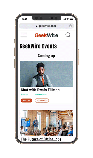
Events
Because GeekWire is so community oriented, we designed a mobile-first page so that the community can buy tickets and engage with the page while they’re on the go. The existing events page wasn’t mobile friendly, so designing a single page with filtering allowed users to find what they’re looking for more quickly.

Site Hierarchy
Category pages help users navigate to the information that they’re interested in reading about, so we wanted to make it intuitive, browsable, and efficient.

Key User Feature
We saw a large opportunity to build on the community-focus of the site, so we designed a personalized account page that holds relevant content for the user in one location. Their news holds bookmarked and recommended articles, and displays filters based on the topics that the user follows. Additionally, any event tickets that they’ve purchased can be accessed on the page.
Takeaways
Ad space isn’t the enemy - in doing our competitive and comparative analyses, I discovered that the amount of ads on the page isn’t necessarily the source of the problem - rather, it’s that the content doesn’t compete with the ads in the hierarchy. Some things just can’t be changed, like where websites get revenue from. What can be changed is how their content appears visually & hierarchically to drive clicks to the right places.
Slow down and do it right - it was easy to get swept up in the speed of the sprint, considering the deliverables we needed to complete. Taking our time to slow down and focus on the persona and their needs allowed us to hone the extra features without making assumptions regarding what needed to be changed. Moving forward with incomplete work for times’ sake sometimes is the right move, but slowing down allowed us to move smarter and faster in the end.